Our Client
Learning a little about our client and their needs for their website
Who they are and why they needed our help:
A Touch of Wellness is a multidisciplinary wellness clinic that specializes in those injured at work (WSIB claims), motor vehicle accidents (MVAs) and general aches and pains. Their main goal is improving the health and well-being to those in their community and know their website is often the first step users take to find them. So they know the importance their website makes on impacting new clients.
They needed a site that was up to date, professional, with greater performance and faster load times, with no errors that could showcase the services and products they offer; to help bring in new clients. They were also hoping to have clients request an appointment online and for users to be able to access their site no matter what device they are using.
Results of a site audit
Our Clients must have list:
Our Solution
How we helped our client solve their problem!
Showcase services
We made sure to showcase the different services the therapists are qualified to treat at A Touch of Wellness. This gives their potential clients a good idea of what each service entails.
A Fresh, Modern, Easy to Use Web Design
Our clients know having a fresh web design that is easy to use and quick to load is a very important aspect users take into account when looking at websites. We gave them a new modern look that will attract new and current users. They have already received many compliments and had new clients tell them they choose their clinic because they liked the web design over their competitions.
Testimonials
A Touch of Wellness receives a majority of their business through positive word of mouth referrals. Having testimonials on their site was very important to show potential clients what their existing clientele are saying and experiencing.
Menus
The navigation bars are sticky menus that “stick” to the top of the users’ browser allowing the menus to be accessible no matter how far down on the page the user scrolls. They are easy to use, clear and provide the user with important information at all times while on their website.
Appointment Form
A Touch of Wellness wanted their new and regular clients to be able to request an appointment online. We gave them a secure form that will allow clients to do just that. This gives their users a variety of options to contact the clinic; they can choose which option works best for them.
Contact Info
Having easy to find contact information was very important to our client. We put their phone number in the top header so it is accessible on every page on the website and sticks to the top of the page so users will always be able to see it. Their contact page is also clearly laid out so it is easy to understand and find the information they need.
Our Redesign for their Website included:
Our Deliverables
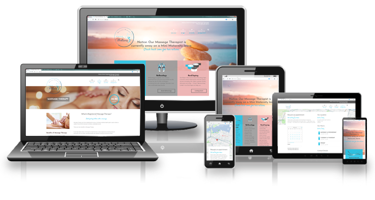
Our new Responsive design for A Touch of Wellness displayed on different devices!

How our great design worked for our client!
Our new Responsive design for A Touch of Wellness
We worked hard with our client to understand their needs to be able to give them the website they needed for their business to be successful.
Our final product met all our clients’a needs and gave them options they did not even think possible. We were grateful for the chance to work with A Touch of Wellness on this project and we are happy they loved the end result.
Our Recent Work
Check out some of the other projects we have completed for our amazing clients
Are you a company in the same situation and are interested in having your site redesigned?
Give us a Call 1-866-320-0011 or please fill out the form if you would like to get a quote for design work. We will send you a questionnaire to fill out so that we can provide you with an accurate quote for the work you wish to have done.
What we can help you achieve
Responsive Web Design | Fresh Perspective | SEO | User-Friendly

