It has been a few weeks since our last installment of “Choosing the Right Colour Scheme for Your Website” series so let’s do a quick recap of what we have covered so far. In Part 1, we went over the basics to colour theory, properties, and harmonies. Then, in Part 2, we talked about the meaning of colour. In this third and last installment, we will cover how to choose the right colour scheme for your website and the best way to implement it.
For most companies when it comes to choosing their colour scheme it is pretty strategic. They usually choose colours for their website based on their brand, logo and marketing resources. However, when they were choosing those colours for their brand, they would have implemented these same principles we are about to go over, to make sure they were choosing the right colour scheme. Although, if you’re just starting a new business you won’t have a logo or brand colours and that is where this blog post will come in hand.
As we covered in Part 2: The meaning of colour; each different colour, shade, tint or tone can express a different meaning. Which can also attract a specific type of customer and even alter their behaviours. Check out this list of interesting stats about the Power of Colour:
- 92% Believe colour presents an image of impressive quality
- 80% Think colour increases their brand recognition
- 90% Feel colour can assist in attracting new customers
- 90% Believe customers remember presentations and documents better when colour is used
- 83% Believe colour makes them appear more successful
- 81% Think colour gives them a competitive edge
- 76% Believe that the use of colour makes their business appear larger to clients
- It takes only 90 seconds for someone to judge and environment/product and 62-90% is due to colour alone
Source: Conducted by Xerox Corporation and International Communications Research, http://www.colorcom.com/research/why-color-matters
As you can see choosing the right colour scheme will play a crucial role in your website’s success.
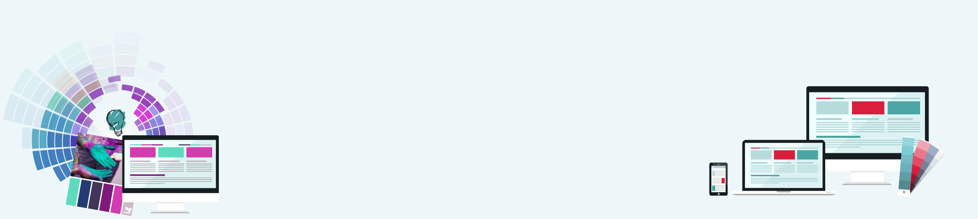
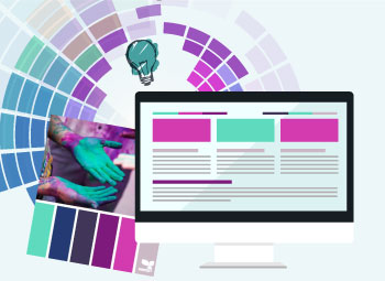
Choosing the Right Colour Scheme for Your Website
Now that we’ve got all of the basics out of the way, let’s talk about how to actually use this newfound knowledge. As we mentioned above the colours you choose can enhance or hinder your design. So it’s important to choose wisely. When you are just starting out this can be a little tricky and you might feel like it is a lot to take on. But don’t stress, there are many tools out there to help you pick your colour schemes, here are a few great resources: www.design-seeds.com & http://colorpalettes.net/.
Here are a few other things to consider when choosing your colour scheme.
 Contrast: Is the difference between 2 colours. When it comes to web design you need to consider two things; readability and drawing your users’ attention to a specific element on a page. For example a light background with darker text for the majority of your site with sections of a darker accent background colour with lighter text.
- Accent colours: Colours that complement each other. We covered a few different types of colour harmony rules in Part 1 you can refer back to. Here is a good resource to help you in picking accent colours: http://paletton.com, as well as Adobe Color CC https://color.adobe.com/create/color-wheel/. If you’re like me and use the Adobe products, it is a great tool to have at your disposal.
- Vibrancy: This is where you want to consider what mood you want to set. Certain colours set a specific mood: the brighter, warmer colours (red, orange, yellow) tend to energize us while darker, cooler shades (green, blue, purple) tend to be more relaxing and tranquil.
 Contrast: Is the difference between 2 colours. When it comes to web design you need to consider two things; readability and drawing your users’ attention to a specific element on a page. For example a light background with darker text for the majority of your site with sections of a darker accent background colour with lighter text.
Now let’s take a look at a few steps that will make choosing the right colour scheme for your website a little bit easier.
Step #1 Pick a Dominant Colour
- Start by choosing 1 colour to be the dominant colour of your website. The dominant colour needs to be the main colour that is going to represent the business. I know this sounds easier said than done. So here are a few tips to help you when picking your dominant colour:
- The dominant colour is your brand’s main colour – if you already have a logo, use the main colour from it.
- What emotions and feelings do you want to bring out? Remember in Part 2, we covered that every colour has a specific meaning and can instill a certain mood on your users. So go over those and decide what you want your business story to be and feelings you want to express.
- How do you want users to remember your brand? Funny, serious, relaxing, energized, etc.
- Who are you trying to attract? Think about your target audience.
- Avoid using competitors’ colours, you want to stand out not get confused with another company.
Take your time and find the perfect shade or tint of your dominant colour. You will need your dominant colour to be locked down before you can move on to the next step.
Step#2 Pick the Accent Colour(s)
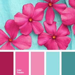
Just like everyone else, you find certain colours look good together while other just don’t. Your accent colour is going to help make your web design more interesting and appealing to the eye. Your safest bet when choosing accent colours for the first time is to follow one of the basic colour harmonies when you’re first starting out. Look back at Part 1 of this series to refresh your memory on what they are. Or using one of the tools we mentioned above is very helpful as well.
Step #3 Implementation
Okay so you have chosen your dominant and accent colours, but you don’t know exactly where to put them on your website. Here are a few tips on where to use each colour:


Your Dominant Colour “POPs” the main areas you want your users to focus on:
- Important Information: phone number, email
- Contact form, Sign up to a newsletter
- Logo
- Call to action buttons
- Main Titles and Headlines,
- Menu tabs, etc.
Your Accent Colour adds a second layer of interest:
- Highlight secondary level of important areas:
- Quotes
- Buttons
- Subtitles
- Section background
- Navigation current tab, etc.
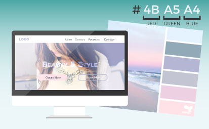
Now that you know where to put each colour, you need to know how to add colour to your website. In order to implement your colours you will be using colour-hex information. This is the code assigned to each colour for CSS and HTML. We could write a whole article on just this so let’s keep it as simple as possible.
A HEX number is a 6 digit colour code, comprised of three sets of pairs combining numbers 0-9 and letters a-f. Each pair represents one primary additive colour. So, for example, for our website we use:

The higher the numbers are, the brighter each primary colour is. Now there is a mathematical string for the makeup of each hex number; 00 is the lack of primary – the darkest possible colour – and ff is the primary at full strength – the brightest possible colour. Let’s look at a few examples of hex numbers: black is #000000 (the darkest possible colour), which makes white #FFFFFF (the brightest possible colour), the red on our website is #D81E3D, and the green/blue is #4BA5A4. I hope this helps explain hex numbers a little bit. If you would like to learn more about HEX colours, you can read this article “Hex Colors: The Code Side of Color”, it’s pretty informative. There are also many websites out there that will provide you with the web safe HEX colour code of a colour you want to use.
So there you have it, the steps for not only how to choose your colour scheme but also how to implement it onto your website. Here are a few final tips:
Final Tips:
Your brand is based off one colour scheme. Once you decide what those colours are, save your colour scheme so you always have it to use for later marketing.
- Don’t get overwhelmed. Take your time and start with one colour that makes sense to the business and build from there.
- Play around. Picking the perfect colour scheme can be hard so have fun and try different options, play with the different colour rules and see what comes out of it.
- Remember to design for your target audience. If your selling cosmetics and want to attract a feminine market try using purple or pinks.
- Have fun! If you’re not enjoying the colours you choose than the chances are neither will any of your visitors.
As you can see choosing the right colour scheme for your website is a very important decision and a powerful tool in how your website will perform. If you are still unsure about what colours to choose don’t worry. We have a design team on hand that can help you through every step of the design process from choosing a colour scheme, designing a logo to developing your website. We are here to help, just give us a call.