
You might think choosing the right colours for your website is easy, right? You don’t need to know about colour theory when picking colours. What does it really matter as long as they kind of go together and you think they look good?
Well as a Web Designer I can tell you that choosing the right colour scheme for your website is actually very important. In a previous blog post of ours: “How to Make your Brand Memorable”; we talked about how colour can have a huge impact on a user’s perception, feelings, and emotions when it comes to your website. There’s even a psychological attachment to each colour which inflicts an emotional pull on the decisions and choices we make and the feelings we get towards something. Finding the right colour scheme for your website can help harmonize your brand and depict the right message to your visitors, which is crucial to your success.


If you are not careful and use improper colour choices, your message might come across the wrong way. This could affect your website’s conversion rates, which could do major damage to your bottom line. Now, don’t you wish you knew a little bit about colour theory so you can choose the right colour scheme? But how do you figure out which colours you should be using?
Over the next few blog posts, we will cover the basics you need to know about colour in order to help you when you’re choosing a colour scheme for your business and website.
And it all starts with understanding colour theory. Colour theory is a huge topic that is so diverse book after book has been written about it. Here we will try to break it down into a few smaller sections to help you understand the basics of Colour Theory.
The Basics to Colour Theory
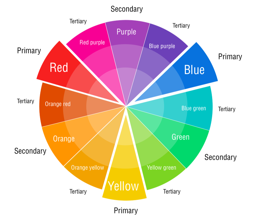
Do you remember hearing about primary, secondary, and tertiary colours back in school as a child? They’re pretty important if you want to understand, well, everything about colour. If not, don’t worry we will cover the basics to help you get a simple understanding of colour. Each one essentially has to do with how you combine hues to form more colours.
If you think back, Primary colours are: red, yellow and blue – these are the colours that everything begins with. Next, we have Secondary colours, which are: green, purple and orange. You create a secondary colour by combining two of the primary colours. Last we have Tertiary colours, which you create by mixing a primary and secondary colour together. Take a look at the image to help you visualize this.
Colour Properties: Colour Theory One-Step Further
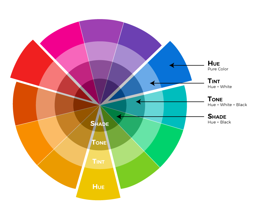
Now besides the main colours we can add different amounts of white and black to them to create endless options. These terms you might not be as familiar with: hue, tint, tone and shade. The Hue is basically just another word for ‘colour’; all the primary and secondary colours are hues. Tints are created when you add white to a colour, making it lighter than the original hue. The tone of a colour is when white and black are added, making it duller than the original hue. Lastly, when you add black to a colour you are creating shades of a colour, making it darker than the original hue. You can take a look at the second colour wheel to see the differences.
Colour Harmonies: The basic Techniques for Creating Colour Schemes
The next area to colour theory is the different colour harmonies you can create by pairing up different hues by using a few different techniques. Now, when it comes to creating colour harmonies it can be very overwhelming at first, especially if you don’t know where to start and the best way to pair colours. Thankfully for beginners, there are a few predefined colour harmony standards that can help you out; monochromatic, complementary, analogous, triadic, split-complementary, and double-complementary (tetradic).
Next, we will explain each of these predefined colour harmonies so you can see the differences between them.
Monochromatic
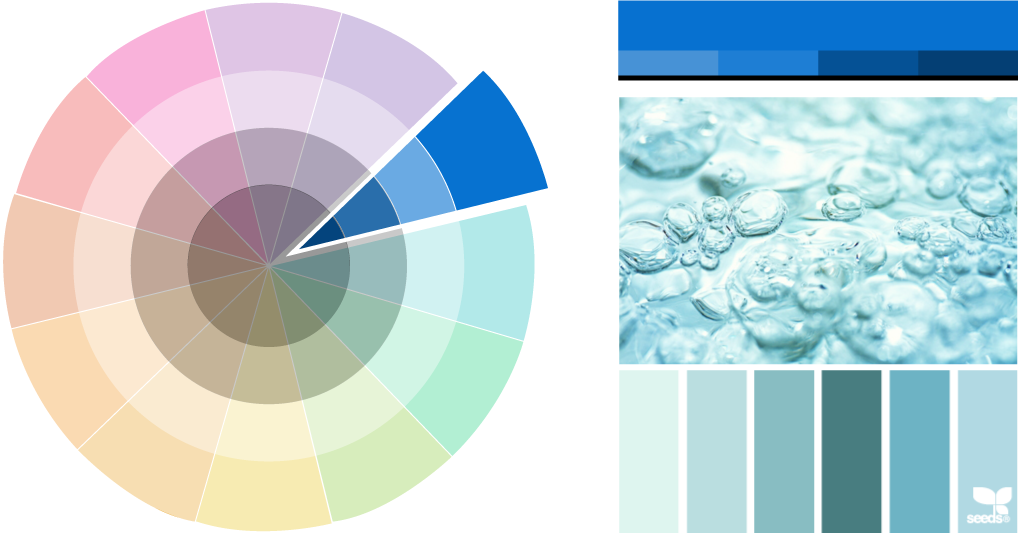
Monochromatic colour schemes are made up of different tones, shades, and tints of a single hue. These are the simplest colour schemes to create, as they’re all taken from the same hue. This is a very cohesive colour scheme that looks clean and polished. However, these schemes usually do not pop or grab as much attention as some of the other colour harmonies.
Complementary
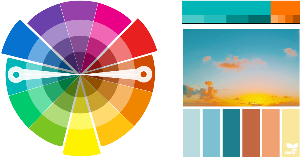
Complementary colour schemes are based on the use of two colours from opposite sides of the colour wheel. You can expand your colour options by using tones, tints, and shades of these colours. Because the two hues will be wildly different, these schemes can be very impactful and noticeable. An effective way to use this colour scheme is to use one colour predominantly and use the second colour as accents in your design.
Analogous
Analogous schemes are formed by pairing one main colour with the two colours directly next to it on the colour wheel. Generally, analogous colour schemes all have the same chroma level, but by using tones, shades, and tints we can add interest to these schemes and adapt them to our needs for designing websites. These schemes are not high in contrast and are typically used to create a softer, less contrasting design.

Triadic
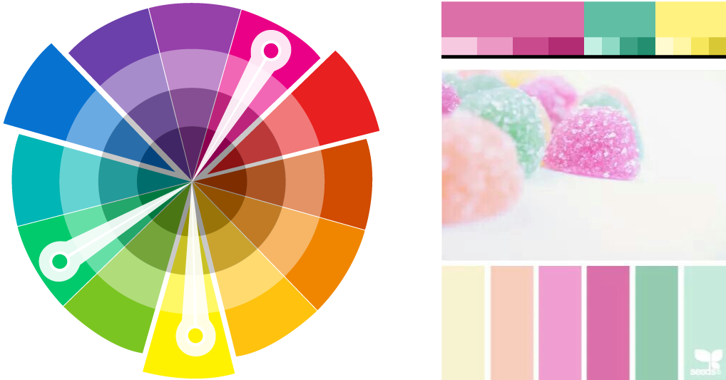
Triadic (Triad) colour schemes are one of the more diverse colour schemes. They are made up of three colours equally spaced around the colour wheel, which can create a very balanced scheme if done right. To use a triadic harmony successfully, the colours should be carefully balanced – let one colour dominate and use the other two for accent. Just like the other colour schemes by using different tints could soften the scheme.
Split Complementary
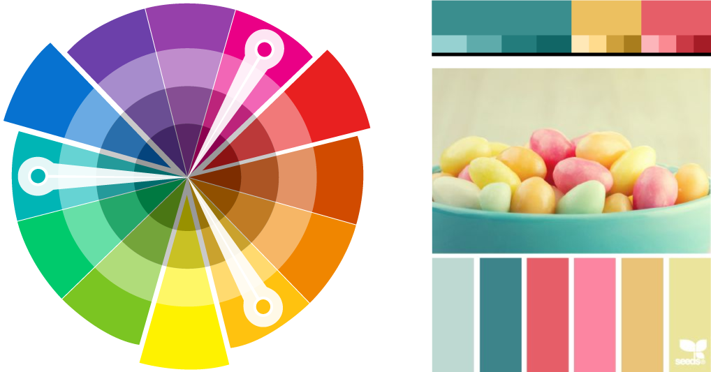
A split complementary colour scheme includes one dominant (base) colour and two colours adjacent to its complement. This might sound confusing so check out the image. It’s important to have enough difference in chroma and value between the colours you select for this type of scheme to work well. Therefore, it might take a bit to find the right combination of contrast and balance.
Tetradic
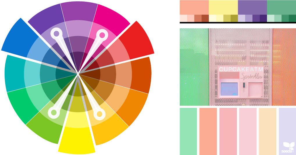
Tetradic colour schemes are probably the most difficult schemes to pull off effectively. This colour scheme uses four colours arranged into two complementary pairs. A tetradic rich colour scheme offers plenty of possibilities for variation and is also best if you use one as the dominant colour.
This overview covers the general aspects of starting to grasp the basics of colour theory. As a result, you can see how understanding the vast number of options available to you when it comes to colour is important for creating a successful website. And now that you know the terminology around colour theory, we can move on to the second section of our blog post to help you even further with choosing the right colour scheme for your website. So check back next week to learn about the many different meanings of each colour.
If you’re thinking this is too much to take in, don’t worry that is what we are here for. If you need help with your web design and choosing the right colours for your brand, we are here to help. Give us a call or visit our Web Design page to learn more.
Resources:
Palettes:
design-seeds.com
paletton.com
Colour schemes:
smashingmagazine.com/2010/02/color-theory-for-designer-part-3-creating-your-own-color-palettes/
webflow.com/blog/web-design-101-color-theory
blog.hubspot.com/marketing/color-theory-design#sm.00015b5qr5156ffceyhxhpht7hp07