In Part 1 of this series: “Choosing the right colour scheme for your website” we covered the basics of colour theory, properties, and harmonies. I also mentioned how each colour has a certain meaning which could affect your website and how people perceive it. Let’s dig into the meaning of colour a bit further.
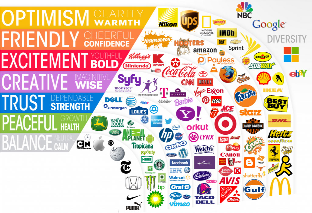
Choosing a colour because it represents a specific meaning could help or hurt the conversions on your website. Did you know 85% of shoppers base their decision on colour alone? It is also important to mention that colours that entice users in North America are different from those in other parts of the world. In this blog post we will cover some of the colour meanings for those of us designing for a North American target audience. Check out this great infographic by Kissmetrics: “How do Colors affect purchases?” – to learn more about how colour is an important choice.
Let’s dive in and see what different feelings and emotions each colour represents. In design different shades, tints, and tones of each colour has different meanings and will affect the way users perceive the content of a website.
The meaning of colour
The colour Red triggers many different emotional responses like excitement, anger, boldness, power, love, and passion. Red associates with a variety of meanings; courage, strength, determination, danger, emergency, daring and aggression. It is also known to raise blood pressure and stimulate people to make quick decisions.
Red makes a powerful accent colour, since it is able to grab a user’s attention and get users to make quick decisions. This makes red a great colour to use for ‘Buy Now’ or ‘Click Here’ buttons on your website. Brighter red can help promote an energetic feel, which would be great when promoting energy drinks, games, cars, and items related to sports & high physical activity. Whereas darker shades can express powerful and elegant designs.
Orange creates a fun, friendly, confident, and cheerful effect. It represents enthusiasm, fascination, happiness, creativity, determination, attraction, success, encouragement, and stimulation. The colour orange promotes a sense of general wellness, joy and emotional energy that you want to share with others.
Orange has very high visibility, so you can use it to catch attention and highlight the most important elements of your design. It’s often considered more friendly, inviting, and less in-your-face than red – but still gets your message noticed. Orange is very effective for promoting food products and toys as it helps to encourage the feeling of hunger and contentment.
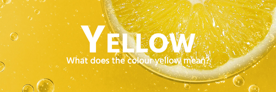
Yellow is the colour of happiness, sunshine, optimism, friendliness, hope, intellect, increases cheerfulness, energy, clarity, and warmth. The colour yellow helps activate the memory, encourage communication, enhance vision, build confidence, and stimulate the nervous system.
Many use yellow to grab their users’ attention, when combined with black it can create an easy to read combination. However, be careful when using yellow, as some people find it strains their eyes. In design, yellow is widely choosen to market children’s products.
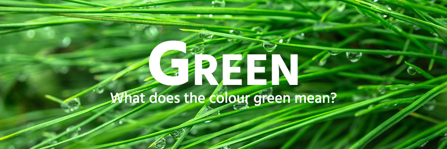
Green creates a soothing effect, it evokes a peaceful and calm emotional response. It can symbolize safety, growth, freshness, life, new beginnings, renewal, and money. Plus, it is the easiest colour for the eye to process; and we know how important that is in a good website design.
In web design, green can have a balancing and harmonizing effect. It’s appropriate for designs that relate to nature – “green, eco-friendly” products, financial industry, renewal, and medical industry.
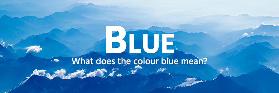
Blue identifies with trust, security, order, strength, stability, depth and cleanliness. It has been shown to calm the senses and lower blood pressure. Blue is a good colour to use to promote banks, legal services, the medical industry, corporate businesses, and products related to the sky and water.
In design, light blues often depict relaxing, trusting, and calming industries. You can use bright blues to represent energizing and refreshing products. Dark blues are excellent for corporate sites or designs where strength, intelligence, and reliability are important.
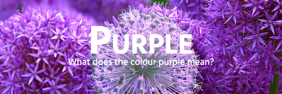
Purple, like all colours has different meanings depending on the hue. It can correlate with spirituality, passion, delicacy, romance, royalty and riches. Yet some hues evoke sadness and frustration so you need to be careful when choosing your hues of a colour.
When dark purple is used in a design it implies royalty, power, dignity, nobility, luxury, and ambition. Medium purples associate with wisdom, imagination, independence, creativity, mystery, and magic. Light purple is a good option for a feminine design, spring, romance, and beauty products. Whereas bright purple is a good choice when promoting children’s products.
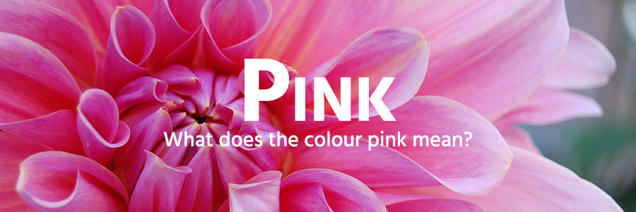
Sensuality, femininity, romance, caring, and love are the emotions that associate with Pink. The colour Pink can also represent cute, playful, thoughtfulness, sweet and charm.
In design, pink usually represents businesses relating to the female market such as cosmetics, salons, fashion, beauty and romance. You can use hot pink to communicate playfulness, and light pink to communicate tenderness. Combining pink with darker colours can give it a more sophisticated and strong design.
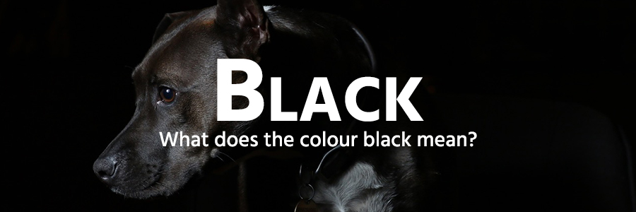
Black generates a sophisticated, solid, secure emotional response. In order for hues to have depth and variation they require black, which makes it a very important colour. Black represents power, elegance, formality, professional, death, seriousness, authority and mystery.
In web design, designers commonly use black for typography and other functional parts because it’s the strongest of the neutral colours. You will often find black used for luxury brands and high-end e-commerce sites. Depending on the colours black is combined with the design could be either conservative or modern, traditional or unconventional.
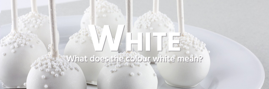
White, an inherently positive colour, identifies with purity, innocence, light, goodness, heaven, safety, brilliance, understanding, cleanliness, faith, sterility, possibility, humility, sincerity, peace, and softness. Like black, white is required when making tints of any other colour.
Many well-designed websites use white space in order to create a sense of freedom, spaciousness, and breathability. Using white can help convey simplicity and cleanliness. White is an appropriate colour for charitable organizations, hospitals, doctors, medical products, as well as bridal services. Use with other appropriate colours that reflect your businesses meaning will help make your design effective.
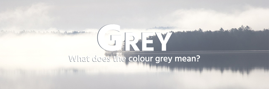
Grey is generally conservative, refined, professional and formal, sophisticated but can also be modern and contemporary. It suggests security, wisdom, reliability, knowledge, modesty, maturity but could also show dullness.
It’s commonly used in corporate designs, where formality and professionalism are key. In design, it is common to use grey backgrounds as it doesn’t attract the users’ attention which allows the other colours used to stand out. It is a great colour choice as it can be combined with almost any other colour to convey different messages and to reach different target markets. For example; combining grey with blue suggests credibility, trust, and reliability. Whereas light grey combined with turquoise, yellow, or light blue can create a high-tech look.
Brown is a warm neutral colour and can be associated with dependability and reliability, with steadfastness, wholesome, elegance, honesty, friendliness and with earthiness. Light brown suggests neatness, openness, approachability and friendliness. Medium brown relates well to nature, wholesome food and agricultural products. Whereas dark brown relates well to sophisticated and professional products.
In design, brown is great option to use as a background colour or texture, like wood or stone. It brings a warmth and wholesomeness feel to the design. Dark brown is a good choice to use for typography when a softer feeling than black is what you are looking for.
In Conclusion …
You now have a general understanding of the meaning of colour. If there is a specific colour that interests you or inspires you, do more research and really dig into the psychology of that particular colour to learn as much as you can about it. You can then use those details within your design to help attract your target market and influence the outcome you’re planning for.
Check back for our next installment to this series where we cover the best way to implement the right colour schemes in your website design.
Resources:
bourncreative.com/meaning-of-the-color-brown/
smashingmagazine.com/2010/01/color-theory-for-designers-part-1-the-meaning-of-color/
empower-yourself-with-color-psychology.com/gray-in-business.html
color-wheel-pro.com/color-meaning.html