Every few months there’s a release of a brand new handheld device. Smartphones and tablets are not only here to stay but are becoming the devices of choice people use to surf the internet. Mobile internet users are projected to go up from 800 million in 2009 to 1.9 billion in 2015!!!!
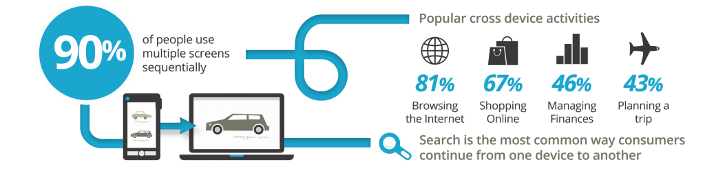
In today’s world consumers move between multiple devices to accomplish their goals. According to a study done by Google:
 Does your site render properly and is it user friendly on the different devices on the market today? It is essential for your website to have one design that adapts itself to multiple screen sizes.
What is Responsive Web Design?
Responsive Web Design; also known as RWD, is designing a flexible fluid website that provides an optimal viewing experience no matter what device the user is viewing it on (smartphone, tablet, or computer). 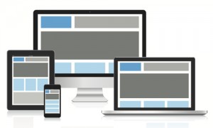 Rather than building separate websites for each web and mobile device, RWD targets the width of the user’s browser to determine how much space is available and decides which type of “css media query” it should use to best display the website. You need to consider factors such as Navigation, Click versus Touch, Screen-size, Pixel-resolution, support for Adobe’s Flash technology, optimized markup, Branding and many more crucial factors while creating websites with Responsive Design. With dynamic re-flows of content it allows for the user ease of reading and navigation with minimum resizing, panning, and scrolling.
5 Reasons why your website should be Responsive:
- Save time and money – You will not have to shell out for a new website every time a new gadget or operating system comes out on the market. Plus it will be easier to maintain as editing your content is done through a single CMS. With a responsive site you can relax knowing your users will be getting an optimal experience as it will adapt to which ever device they visit your site on.
- Great user experience – It is the experience they have with your site on whether they stay or go somewhere else. By providing them with an optimal experience no matter what device they visit you’re site on
 your going to gain return visitors and in turn more sales.
 - Cross Platform and Future Proof – Your site will respond accordingly to any user’s device today and any new, ever changing technology that will come out in the future. Your user will always know they are in the right place as your site will look cohesive among different devices.
- SEO friendly – links are cleaner and used across platforms. Plus Google recommends using responsive web design.
- Increase sales – Your sales will increase. It is said that smartphones enables spur of the moment shopping; a study done by Google found that 81% of the sales made online is done spontaneously.
 your going to gain return visitors and in turn more sales.
Responsive Web Design is the way to go; providing a great user experience across many devices and screen sizes.
To see great infographics on Responsive Web Design check out our Pinterest account.