There is a lot of talk and debates online about whether Flat Design is here to stay or is it just a fad? Is flat design a better design concept than the popular Skeuomorphism design? And what is this Almost Flat Design all about? First off let’s start with what each of these design concepts are and give the pros and cons and then you can decide for yourself which is the best way to design.
Flat Design
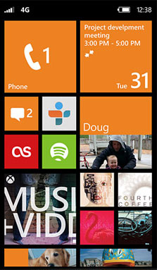
 One of the big trends people are talking about and starting to implement in their applications today is “Flat Design”. Flat design is taking the old saying “Less is more”, and running with it; clean designs, and a strong focus on colors and typography. It is designing with no realism; no use of gradients, textures, bevels or shadows to mimic three dimensional design. Microsoft Windows 8 is a pioneer in Flat Design. The major issue with flat design however is usability! One main concern when creating an application is how user friendly it needs to be. Being able to distinguish elements as clickable or not should be obvious to our users, if everything is designed flat they would have to click on everything to know if it is a link or not, in turn providing our users with a poor experience.
Skeuomorphism Design
Skeuomorphism is designing applications with realism in mind. Apple has  used this concept for their applications from wood grain backgrounds, curled corner on pages, glass buttons, and leather with realistic stitching. One argument would be; why not make things as user-friendly as possible. If we make it look like a calculator people will know what it is and how to use it. They can distinguish between something that is clickable and something that is not. But where is the creativity and thinking outside the box? With an application we could customize our application to fit our users not just do what has already been done. There is also over use, and false functionality; showing the corner of a page curl up looking like the page has the ability to flip when it doesn’t, giving the impression this has specific functionality when it does not. This could confuse our users as well.
Almost Flat Design
 Now that we know what flat and Skeuomorphism designs are all about, what is Almost Flat Design? Matthew Moore states it very nicely in his blog Almost Flat Design saying; “With any great debate, the best solution usually lies somewhere in the middle. Compromise is hard for people with extreme opinions, but it usually benefits the masses. In this case, those masses are the users of our products.” I completely agree with his statement. Being extreme to one side or the other is not designing smartly and to our users’ needs. You need to take aspects from each and create the best option out there. Matthew goes on giving an example of how Google uses Almost Flat Design in their interface. They have a flat overall design but use gradients and drop shadows subtly to distinguish depth and encourage specific user actions.
Overall I do not think designing only flat or only with skeuomorphism is the best option, it is not a black and white, cut and dry industry. That is where knowing your audience and the functionality they need really is important when designing. Allowing you to use your creativity to come up with the best design solution with which ever concept it follows.
