In today’s business environment having a website is pretty crucial to any business, even just for informational purposes. And with the digital world growing, with 60% of all website traffic coming from mobile devices, having a Responsive Web Design is more important than ever.
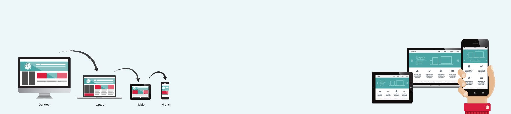
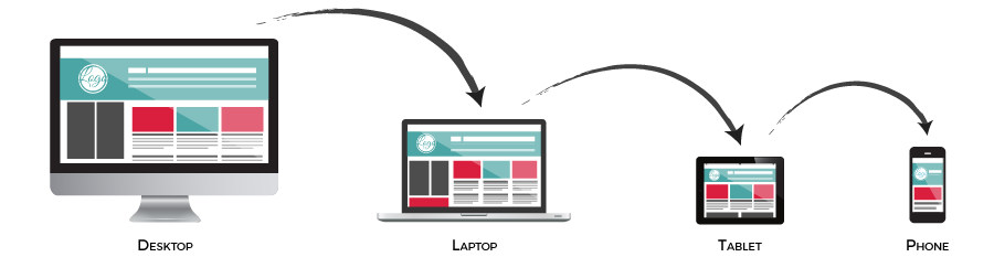
RESPONSIVE WEB DESIGN, also known as RWD, is when the design and development of a website respond to the screen size, platform, and orientation of the device based on the user’s behavior and environment. This is achieved with the use of CSS media queries, flexible grids, layouts, and images.
Let’s look at it this way. Think of a topic, anything you would search for on Google; type it into the search bar (on your desktop) and click enter. Now scan over your results from your search and click on a link that you think will be helpful. How long does it take you to find what you are looking for on that website? Is the site easy to use and navigate? If so then the designer/developer has created this site with usability in mind.
Now move to your phone or tablet and do the exact same search. Is the same website as easy to use and navigate on these devices? Is your experience consistent across all your devices? If the answer is no, it means the website wasn’t designed to be responsive and most sites out there still aren’t. A study found that 60% of sites are not responsive. And no one is going to stay on a site that doesn’t work properly or “Respond” well on their mobile device. This is a big problem for you if 60% of traffic is coming from mobile users.
Here we will look at some benefits on why it is important for your site to be responsive in today’s digital world.
8 Essential Benefits in having a Responsive Web Design:

Lower Cost
Before Responsive Web Design businesses used to have 2 versions of their website. One for desktop users and one for mobile. However, now that is not a plausible option with the thousands of phone and tablet versions being released. Designing a separate version to be compatible with each one would be way too expensive and time-consuming. Therefore, in the long run, Responsive Web Design is the logical choice to save money and time.


Reduced Website Maintenance Fees
With Responsive Web Design, you would save on maintenance fees by only having one site to maintain. It will also free up some of your time from not having to update, test and support multiple versions – – you just need to update one CMS – – which saves you valuable time and money to spend on other important areas of your business.

Increased Traffic
When you have a Responsive Web Design that responds well on all devices your traffic will increase as your bounce rate will decrease. When users visit your site through keyword search results, they will experience your responsive site and see how good it is to use and navigate. This will result in them staying on your site until they complete their task and even come back again in the future. In turn, if its poor and non-responsive they will leave and visit a competitor’s site and you don’t want to lose business because your site wasn’t responsive do you?
With more than half of website traffic coming from mobile devices it is increasingly important that you have a Responsive Web Design so they can experience your site seamlessly no matter what device they use to visit you on, potentially resulting in more sales.

Improved SEO
Responsive Web Design is becoming as important to search engine optimization as quality content. And one way to improve your ranking is to have a Responsive website. Google recommends a Responsive Web Design pattern. It also makes for a good user experience and improves your SEO efforts across all platforms. Stronger backlinks and fewer bounce rates also translate into higher search rankings.


Provides a Seamless User Experience
Having your site appear and feel the same across all devices is vital to your users’ experience. With a Responsive Web Design, your user will not need to pinch the screen to zoom in & out and no more side-scrolling to see an entire site that doesn’t fit the screen. Your site will have a layout that fits properly with each device and screen. This is one of the greatest benefits of having a Responsive Web Design. You want your users to not only stay on your site to finish out their task but to come back and even tell others about your site. And a better user experience reduces bounce rates, boosts website conversions and improves brand perception. Your user will always know they are in the right place as your site will look cohesive among different devices.

Increase in Sales
 Online shopping is increasing each year. As security and technology mature, people become more confident shopping online. 80% of consumers regularly use their smartphones to shop online and this number is going to keep on growing. 70% of shoppers now use their mobile phones even while in stores to look up a product to see if they can find it cheaper somewhere else. They will even buy it right there on the spot if they do.
Smartphones have increased spur of the moment shopping, as shoppers don’t want to miss out on that deal! Therefore, if your products and services aren’t online or easy to view from a phone, you’re missing out on a major opportunity. It is becoming harder and harder to compete with the online market. Having a responsive website will guarantee shoppers will have a better user experience and potentially stay longer on your site, which will hopefully result in more sales.

Future Scalability
One of the leading benefits of a Responsive Web Design is that this method gives you the best chance to support newer devices and screens in the future. Responsive sites are fluid, scaling up or down as needed to best fit the screens being used to access the site. As more screen sizes we never seen before are released you don’t need to worry if your site will respond well to it, you already know it will with a Responsive Web Design.

Less Duplicate Content
We talked about how to get positive ranking but one way to have a negative impact on your ranking is to have duplicate content. For those who choose to have a separate site for desktop and mobile may run into this issue. If you do not make it clear to Google which content is most vital and ensure that it is the content being indexed, then they will have to decide for you. Having a Responsive Web Design takes care of this issue for you; one site, a singular URL, and no duplicate content means you tell Google what content is vital.
 As you can see it is beneficial for you to have a Responsive Web Design now and for the future. If you have any questions about Responsive Web Design please let us know. Or if you’re interested in having your website redesigned Responsively contact us today!