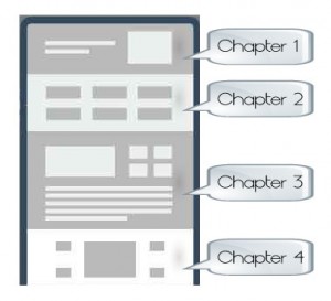
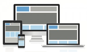
Responsive, Modular, Portable and now Pageless Design; they are all connected but how should we be designing for the future and for multiple devices, even ones that are not out on the market yet? Many are saying Pageless Design is the way we should be designing for the future of the web.
What exactly is Pageless Design?
Nathan B Weller, the author of “8 Reasons Why Pageless Design is the Future of the Web”, explains Pageless Design as it being “a simple, straightforward design combined with a great story and instinctive interactions that propel site visitors along a single path towards that final goal.” It offers the users more than a landing page and is less confusing and overwhelming than a traditional website.
 Stories are how we’ve communicated since the beginning of time, and are still the most effective way for brands to communicate with their consumers. Audiences lose interest online fast, but the visual and interactive aspect of Pageless Design keeps them engaged. Similar to a mobile app in which visitors continue to scroll down to see more information, it’s easy for them to locate anything on the site quickly. Additionally, Pageless Design sites transition well onto any device and look great on smartphones and tablets as well as traditional desktops.
Okay that is great and all but why should we design with Pageless in mind?
Benefits of Pageless Design:
- User experience is improved. Navigating content is faster, flows nicely and more responsive than having to go from page to page.
- Low maintenance. You only have to maintain one page.
- Content is either already on the page or loaded with Ajax so there is no need for Page refresh when navigating.
- Quality over quantity. Rather than designing multiple layouts for different types of content, you focus on a single high-quality design.
- Great for single product or brochure sites.
- Responsive, will look good on any device. Single page sites are designed for the Mobile Web.

- Your website will stand out. Single page sites are less common, more distinctive, and will leave a positive impression on your visitors which will cause them to share it through word of mouth. I know when I find a really cool site I have to tell others about it.
- Conversion rates increase due to the site being simple, straightforward and focused on the goals the site wants their users to complete.
These benefits sound great however there are some things that need serious consideration before you have your website designed using the Pageless concept.
Negatives to Pageless Design:
- SEO – There is a bit of controversy with this one. Some say that since all of your site content exists on one single page, you miss the opportunity to define important meta data and title tags within the site. Although others say you can have great SEO due to higher core content density, it is search engine spider friendly. Your Google PageRank score will apply to the whole site.
- Slow Upload time as all the content is on one page, which could cause visitors to leave before they get to see your site.
- Not good for large sites that need other pages, example a large product inventory, or gallery.
- Learning curve, takes a while to learn and understand the element functions.
Overall Pageless Design is a very exciting and interesting concept. People communicate best through stories and that is exactly how Pageless design works. Audiences lose interest on line fast, but the visual and interactive aspect of Pageless Design keeps them engaged no matter what device they are looking at the site on. Take a look at some of the sites that have gone Pageless and have done a great job doing so.


